Verizon Retail Design System
Role: Design lead
Company: Verizon
Creative Director: Jacqueline DiMaria
Designers: Mengjie Jui, Gowoon Sen
Double-click to edit...
Task
Verizon had a robust web design system, but when it came to their retail landscape, designers were retrofitting web system components into a very different environment, causing inconsistency and confusion for the customer, as well as frustration for the designers.
Since the company was continuing to expand its digital portfolio, Verizon was ready to find a lasting solution to this problem.
JTBD
Verizon’s teams needed a tight set of design tokens and elements in order to build cohesive digital experiences as efficiently as possible.
Goal
We created a MVP for a unified design system across all digital touchpoints in Verizon Retail in close collaboration with the web team and various stakeholders across the company within 8 months, hitting our time goal. Designers adopted and started using the guidelines after CCO approval.
Research and Findings
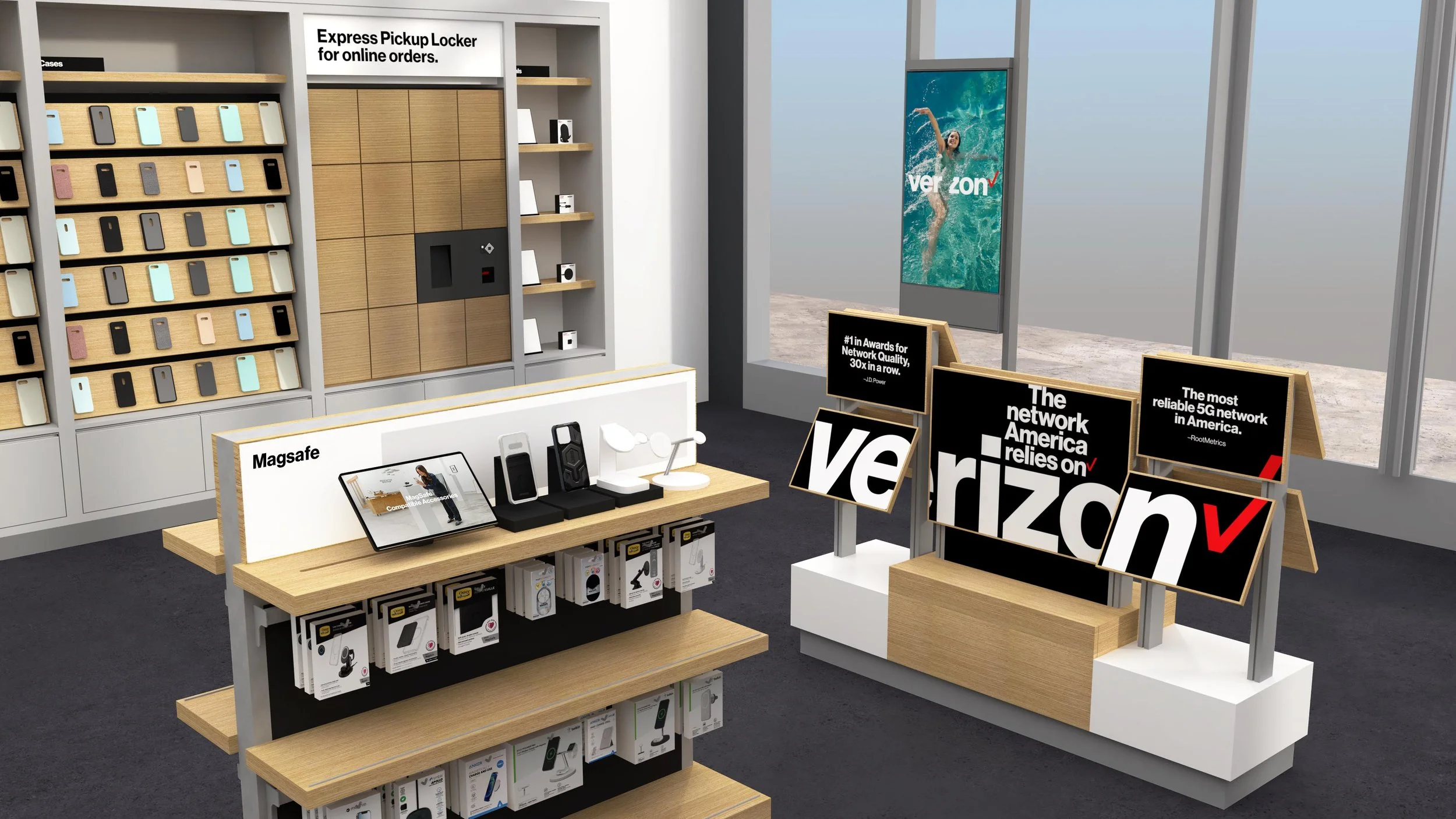
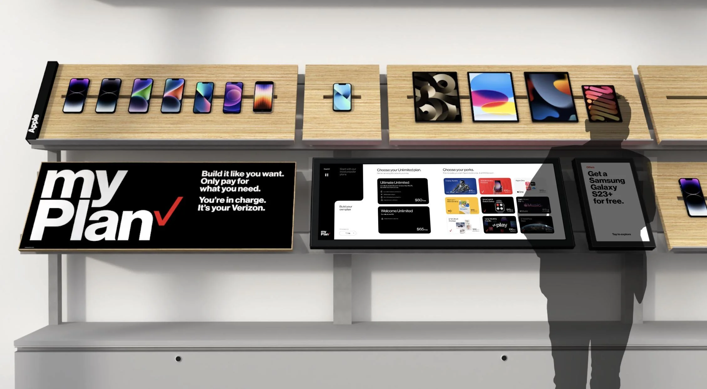
Current Views of Verizon stores
Strategy
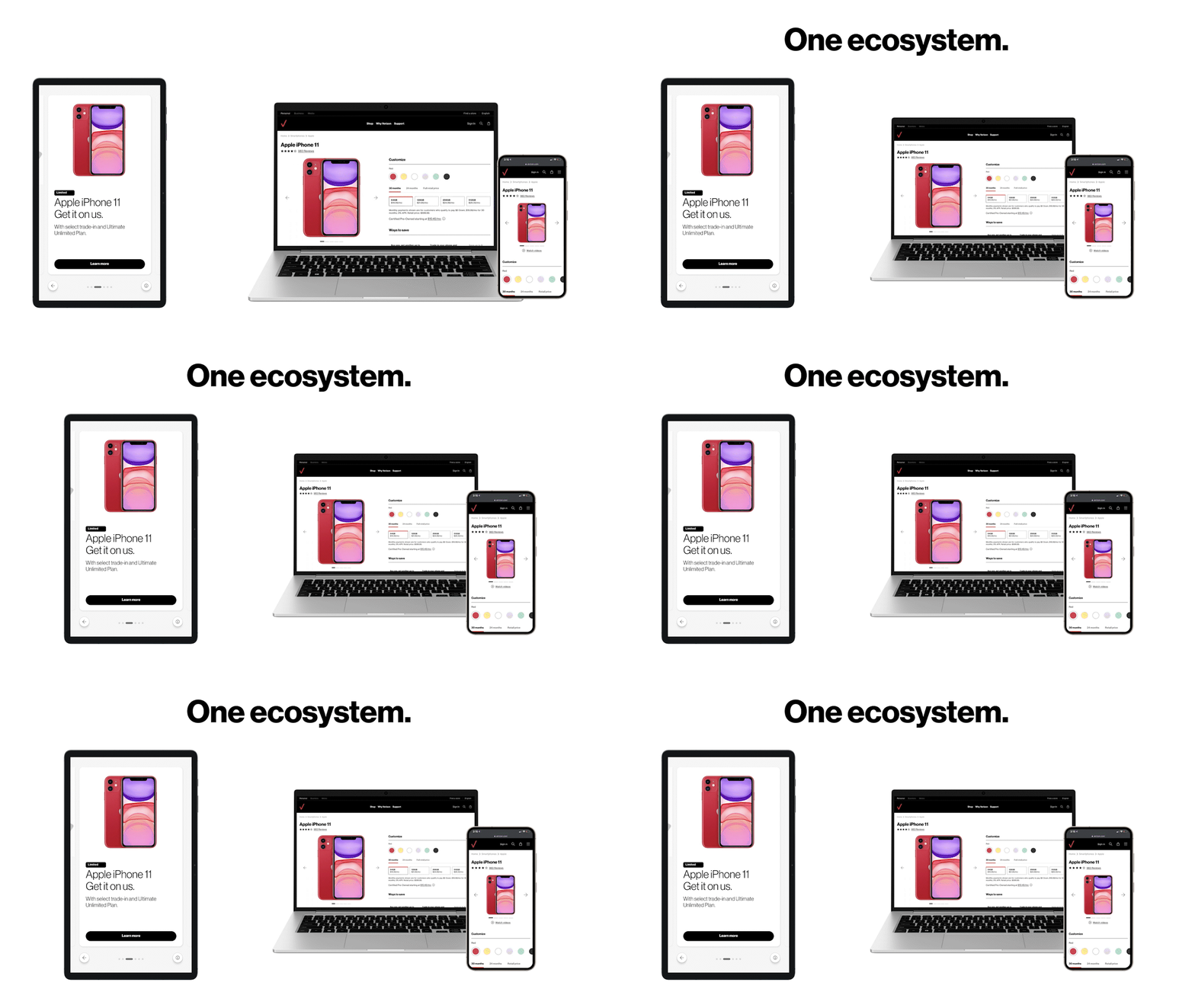
The strategy for the design system adhered to Verizon’s platform strategy called One Digital. Its goal is to unify and define digital touchpoints and components in Verizon’s retail stores, encompassing both physical and digital elements.
To create the system, we needed to work closely with the web team to understand where we could maintain consistency and where retail design needed to remain unique.
Tenants of One Digital
Tell a story
Keep it human
Be intentional
Interviews
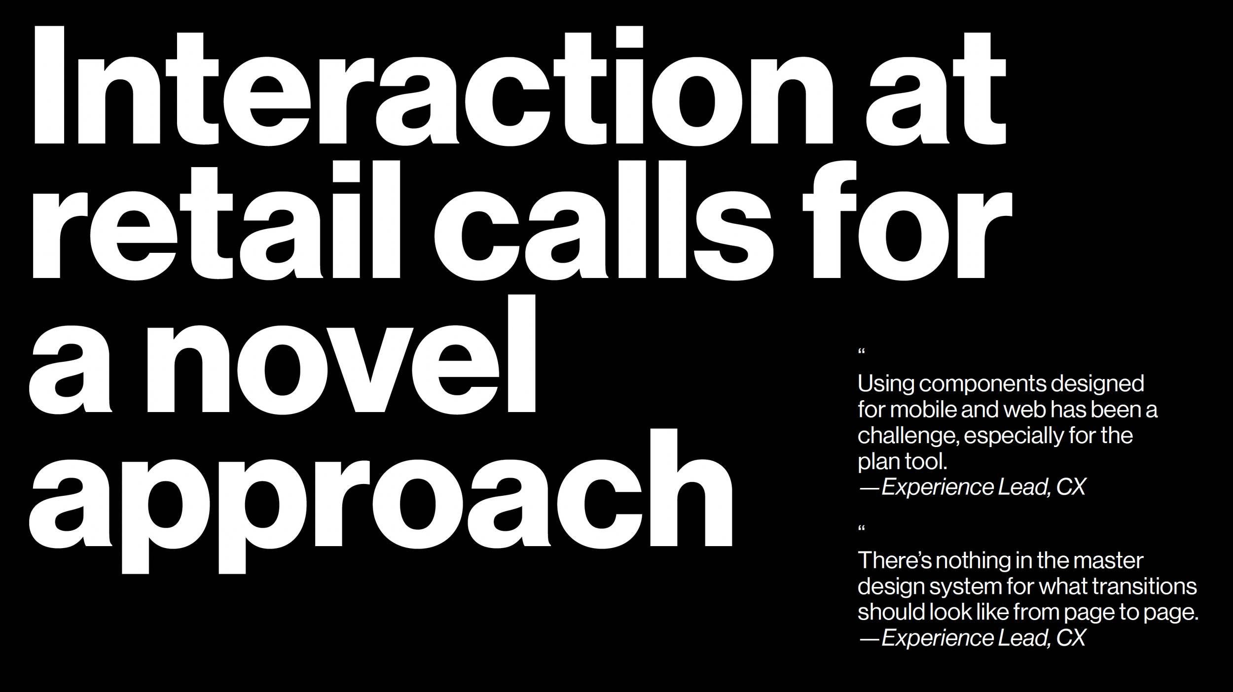
We conducted interviews with stakeholders within the two main groups who were directly and indirectly associated with the Retail vertical.
Audit and Findings
We conducted an audit on the current state of design within the Verizon digital universe from our device styles and dimensions, to interaction modes, to the diversity of business lines, and the current customer research on all retail experiences.
We marked inconsistencies and unique approaches.
48 overall audit findings.
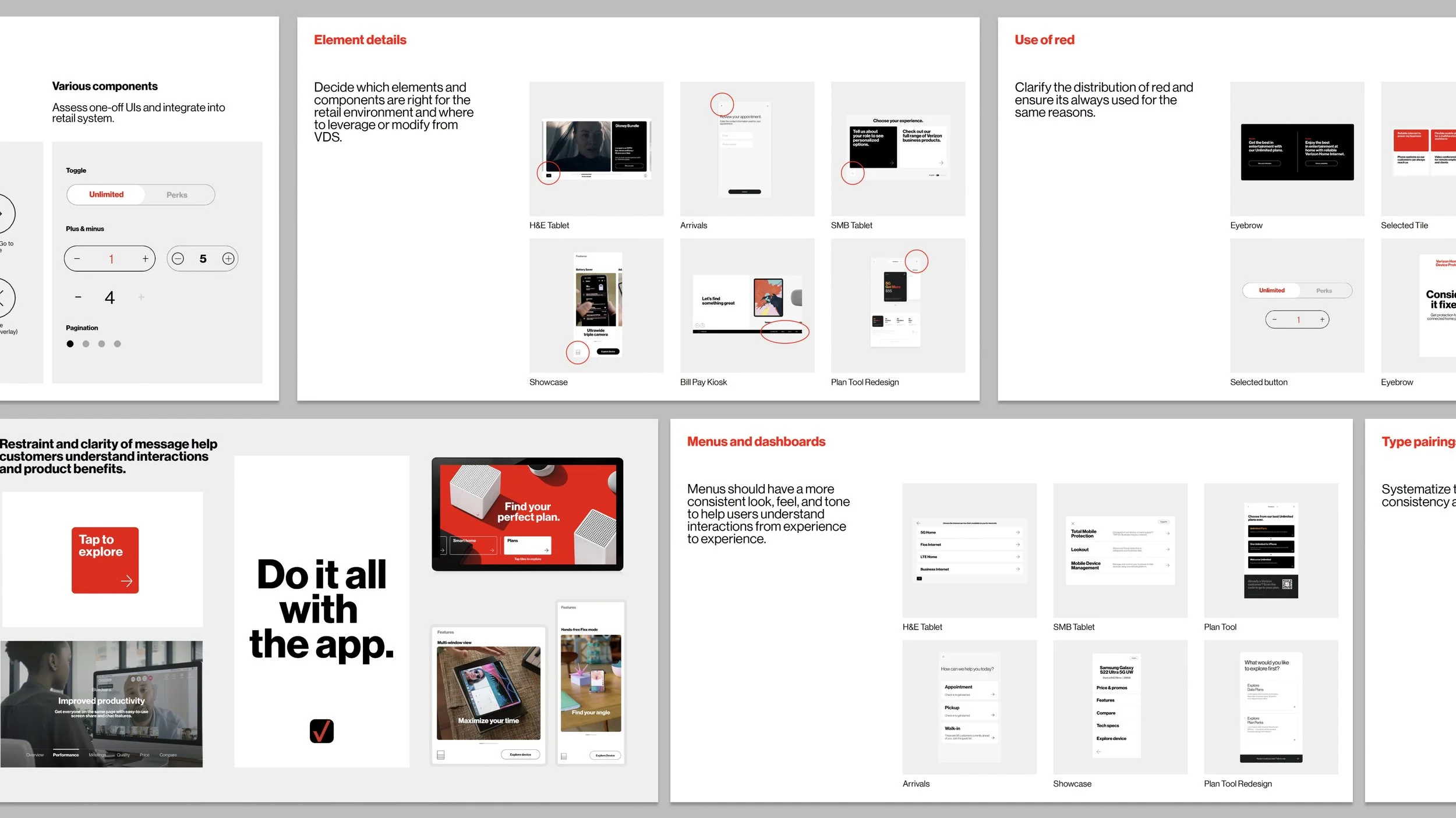
Key areas of Improvement
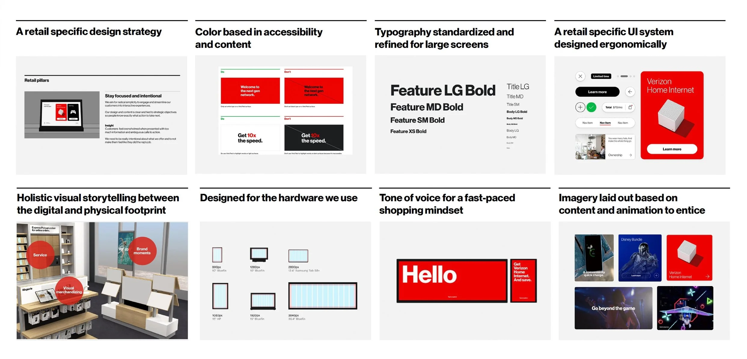
We then applied our findings to the following key areas of improvement:
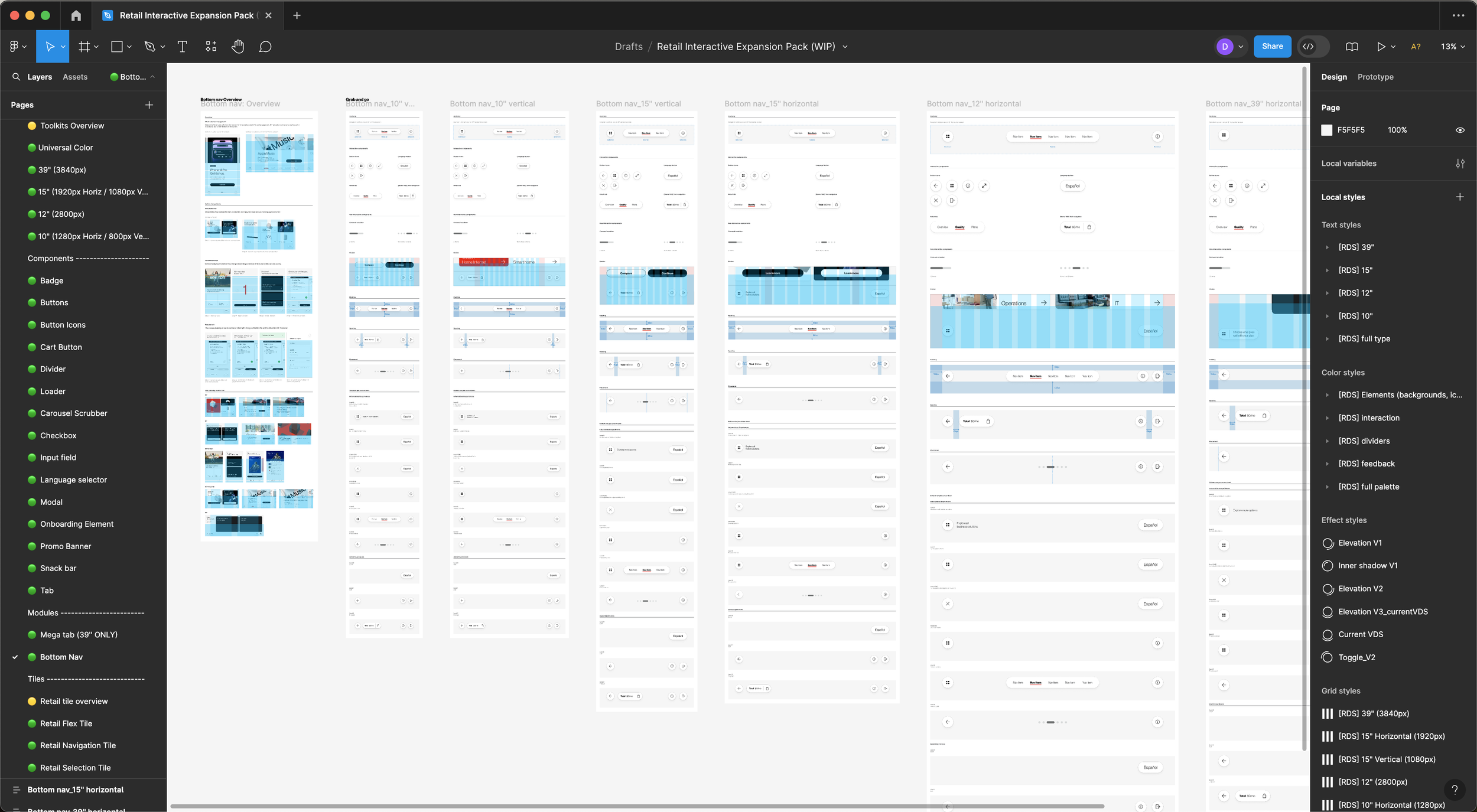
Figma System
Over the next few months we built out the figma design system for retail alongside the Web team so that we could make sure the two systems would align.

User Testing
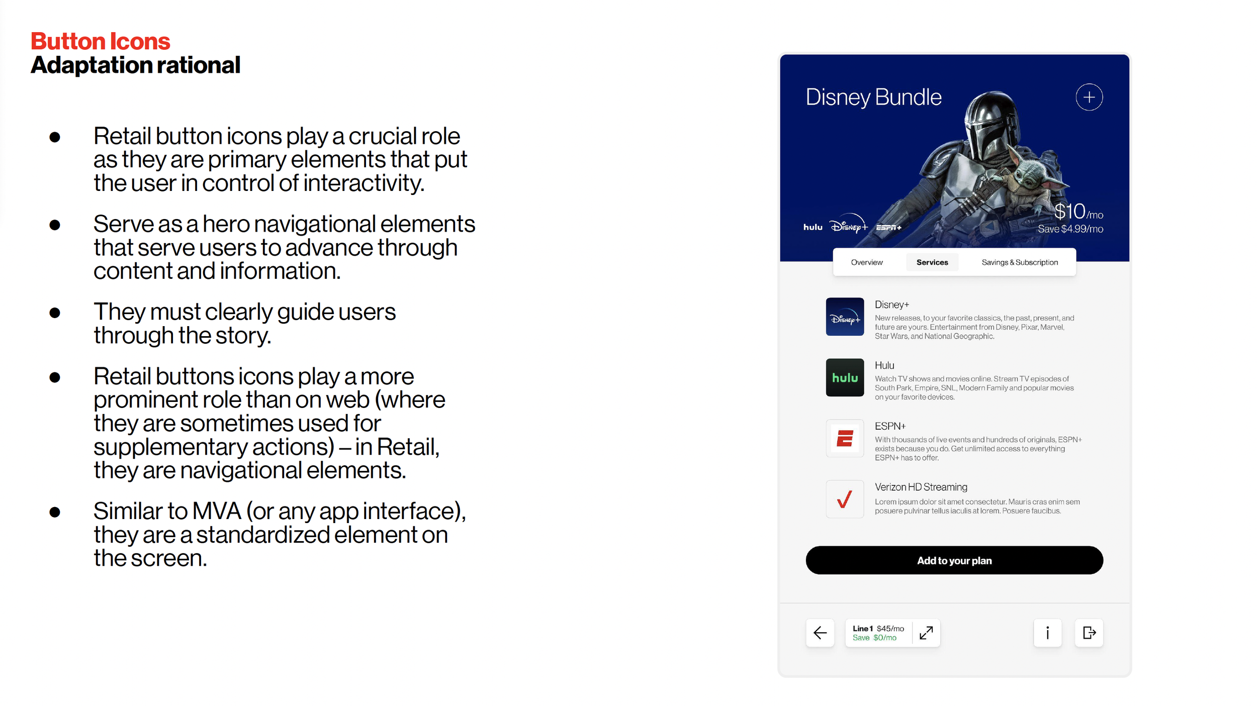
Throughout our design process, we user tested in the Verizon offices with people from our interview groups onscreen so we could understand whether some of our unique components were beneficial to the experience.
We tested:
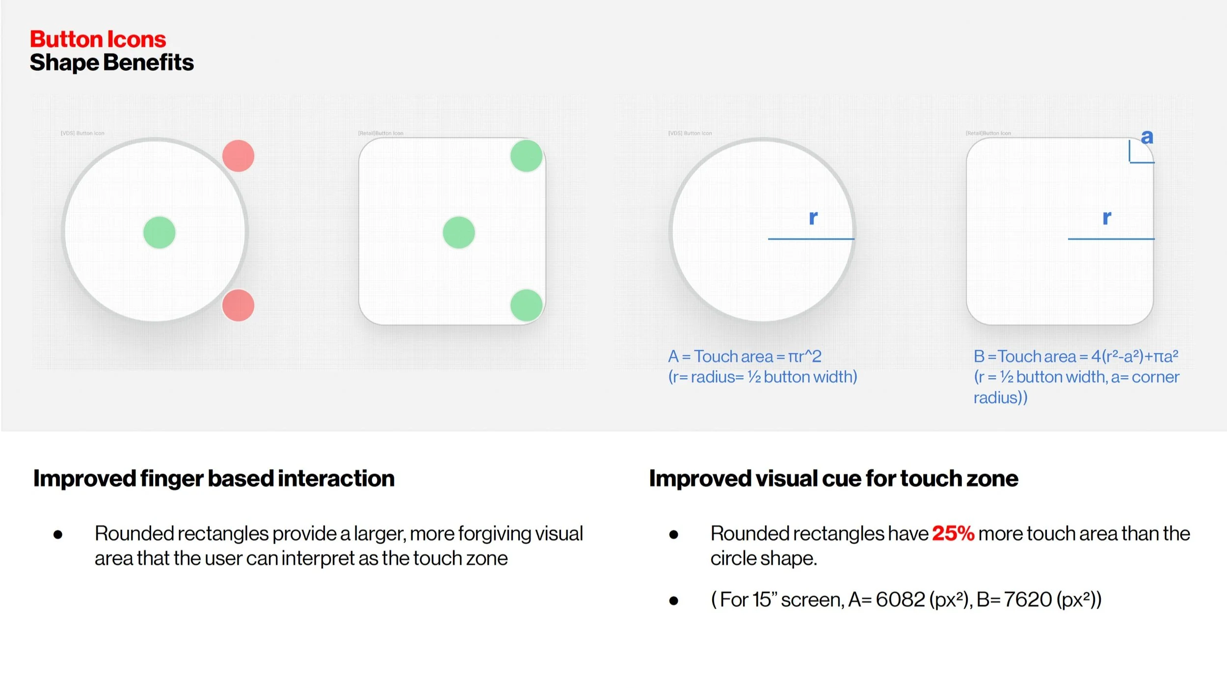
Button icons
Retail Tabs
Carousel Scrubbers
Selection tile
We synthesized our findings and presented them to the Web team for a thumbs up to move forward with these unique components.
Brand guidelines
Along with the figma system, we created guidelines, which live on Brand Central in the Verizon brand hub. These serve to explain to designers and non-designers alike how to properly use the system and additionally how to strategically think about Retail design.
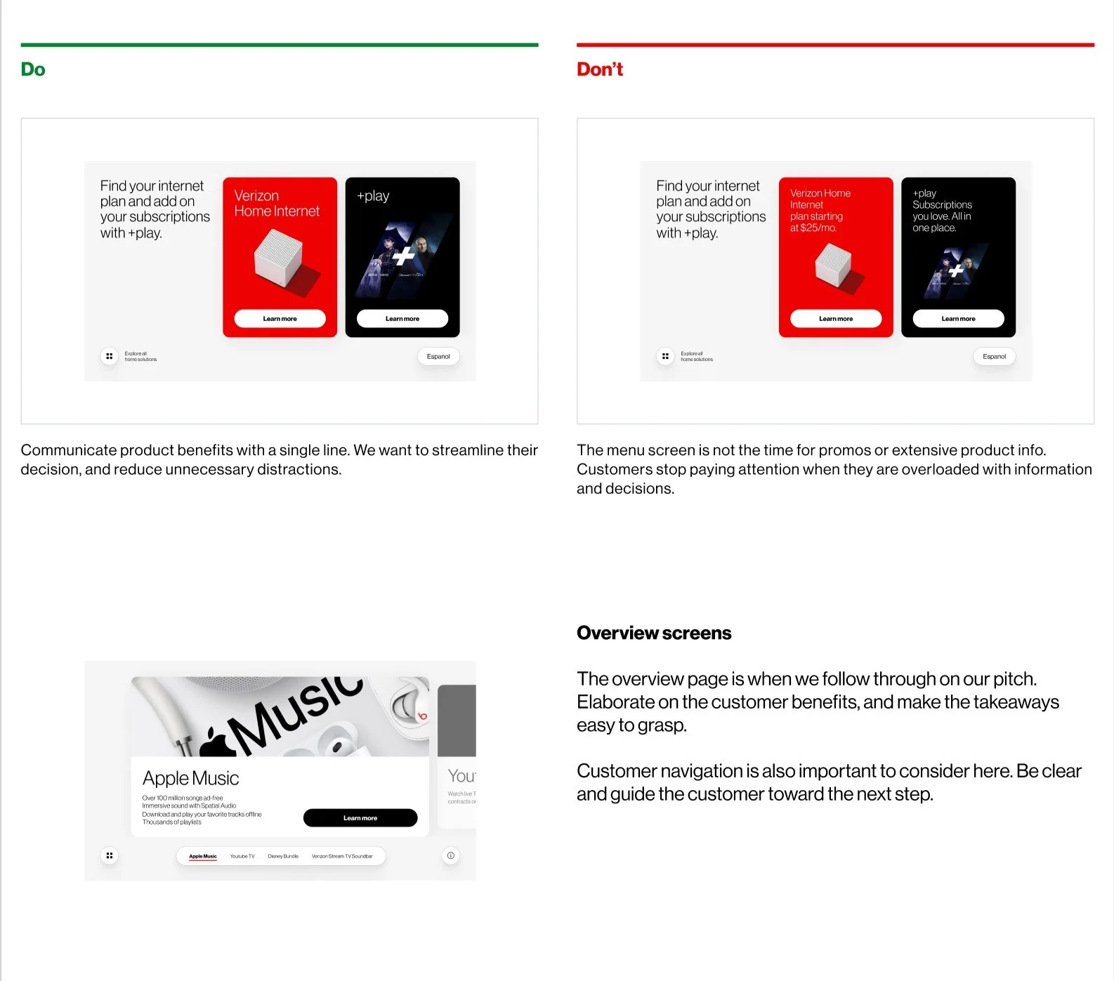
Clip of Do’s and Don’ts from the content section.